
In this article
- See who’s doing what, at a glance
- Leave and overtime are no longer easy to confuse
- Bank holidays organised properly wherever your team is in the world
- Know at a glance whether a day is a working day
- Celebrate your team’s work anniversaries
- Joiners and leavers are all clearly marked
- Team leave limits without the guesswork
- Team details are one hover away
- Print view option
- More changes to the Wall Chart
If you’ve ever squinted at a Wall Chart trying to work out who’s off, who’s back tomorrow, or wondered whether that gap in the calendar is a holiday or someone leaving the company, this update is for you.
Over 50,000 people are waking up to a new Wall Chart today.
It’s the result of every piece of feedback we’ve received on this feature, rolled into one release.
We have redesigned and developed a whole new Wall Chart from scratch. It’s taken over a year of brainstorming, designing, and engineering.
Here’s what’s changed, and what it means for you.
See who’s doing what, at a glance
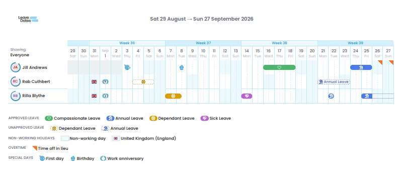
Every bar on the Wall Chart now carries an icon and a name, so you know exactly what type of leave someone’s on without a single click.
This means you no longer have to remember what all the colours mean, we’ll just tell you.
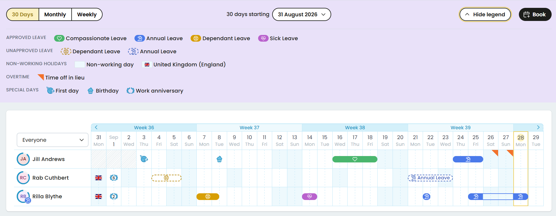
Annual leave, sickness: it’s all visible on the surface.
Why it matters:
Managers spend less time wondering “wait, are they off sick or on holiday?” and more time actually managing.
And if you want the full picture, a legend is one click away, covering every icon on your personal chart.
Leave and overtime are no longer easy to confuse
Leave now shows as a bar.
Overtime shows as a triangle.
Two different shapes for two very different things, so you’re never reading a day wrong at a glance.
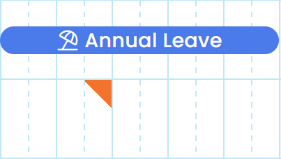
Plus, if you need the detail, it’s right there when you hover over the day.
Why it matters:
Fewer misreads, and fewer “hang on, that doesn’t look right” messages in your team.
Bank holidays organised properly wherever your team is in the world
Bank holidays now show automatically for your country, including working bank holidays for teams in Eastern Europe and China.
A flag marks the holiday itself, and the background tells you whether it’s actually a working day or not.
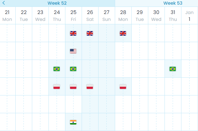
Why it matters:
If you manage a distributed or international team, you’ve probably had the “is that a holiday for them or not?” conversation more than once.
Working with a global or regional team?
With Leave Dates, spotting upcoming bank holidays in 200+ countries and regions is easy. Simply load the regions you need for your team and sync with the calendars and tools you already use.
Know at a glance whether a day is a working day
A blue background means a non-working day.
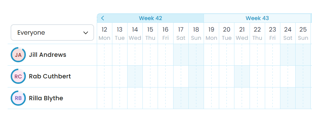
Combined with the bank holiday flags, you can read a week’s shape (working days, holidays, weekends, and non-working days) without opening a single detail view.
Perfect for countries that have compensation days that fall on different weekdays each year.
Why it matters
You’ll have faster planning, especially when you’re trying to find a day that actually works for a team meeting or deadline.
Celebrate your team’s work anniversaries
Our most popular request is now available:
The Wall Chart now shows work anniversaries, including how many years someone’s been with the company.

Why it matters:
The small things that make people feel seen are easy to forget when you’re managing a busy team. No one wants to miss out on the opportunity to have some cake and celebrate an anniversary!
Now it’s on the calendar you’re already looking at every day, not buried in a separate reminder you never set.
Joiners and leavers are all clearly marked
New starters and people leaving the business are now clearly communicated on the chart.
Anyone not currently employed is greyed out before their start date and after their leave date.

Why it matters:
No more wondering whether someone’s just not scheduled or actually no longer with the company.
It’s visible at a glance, and you can prepare your welcome (or goodbye) party. Everyone now knows exactly when the new colleague starts or leaves.
Team leave limits without the guesswork
When a leave limit is reached for a day or a week (for a team or a department), the chart now highlights it with a clear notice that no more leave is available for that week.
Managers can hover to see exactly who’s already away.
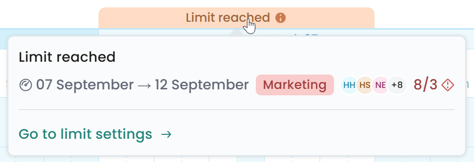
Team members can see a variety of options depending on their permissions.
Full permission to view leave on the Wall Chart means you can see everyone who is off, and thus the limit is reached.
Partial permissions might show you a name + 2 others are off, and thus the limit is reached.
And finally, no permissions means you’re unable to see anyone’s names, it just shows a number.
Why it matters:
Fewer leave requests will need to be declined after the fact, because the limit is visible before someone submits one.
Team details are one hover away
Managers can hover over a team member’s icon and see their details and allowances at a glance.
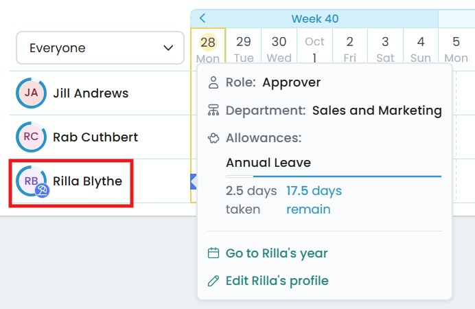
There’s no need to click into a separate report to check someone’s remaining balance.
Why it matters:
You can approve requests faster with the full picture in front of you rather than three tabs open.
Print view option
A print view is now available for anyone who wants a physical copy for a wall, a meeting, or a handover.
Why it matters:
Not every team runs entirely on-screen, and now the Wall Chart doesn't force you to.
More changes to the Wall Chart
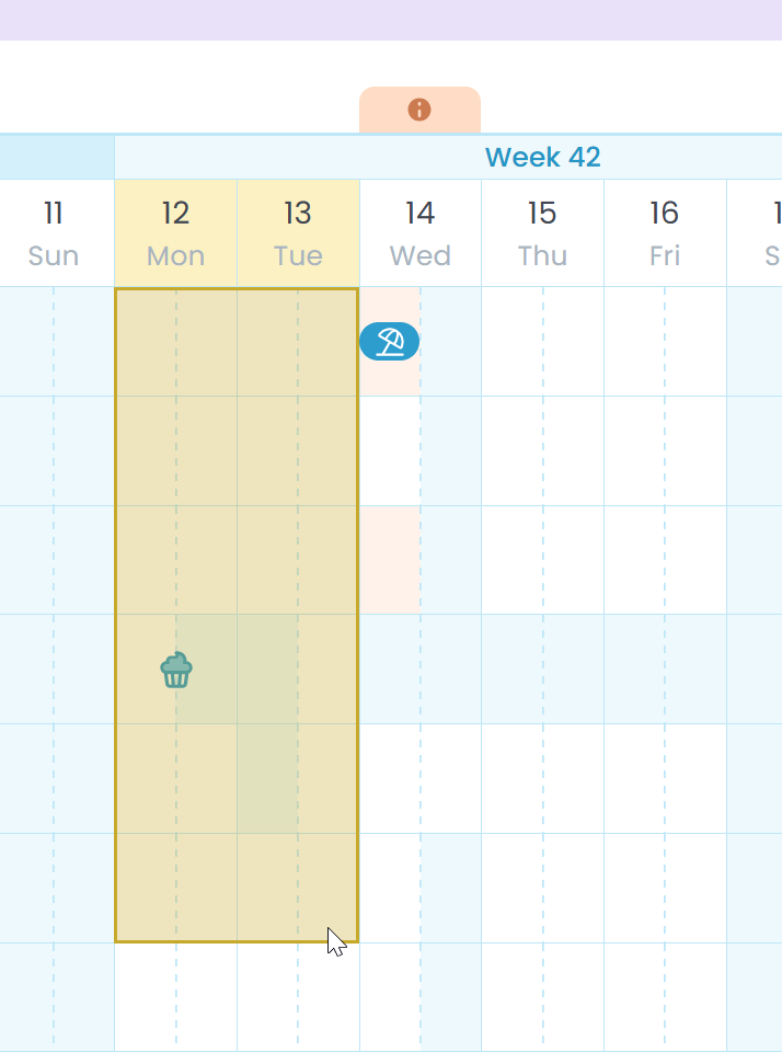
Admins can now drag over multiple rows in the Wall Chart to easily request leave for multiple people at the same time.
The Wall Chart now defaults to the current week being left-most on the page, so it’s easy to see the current week and future weeks at first glance.
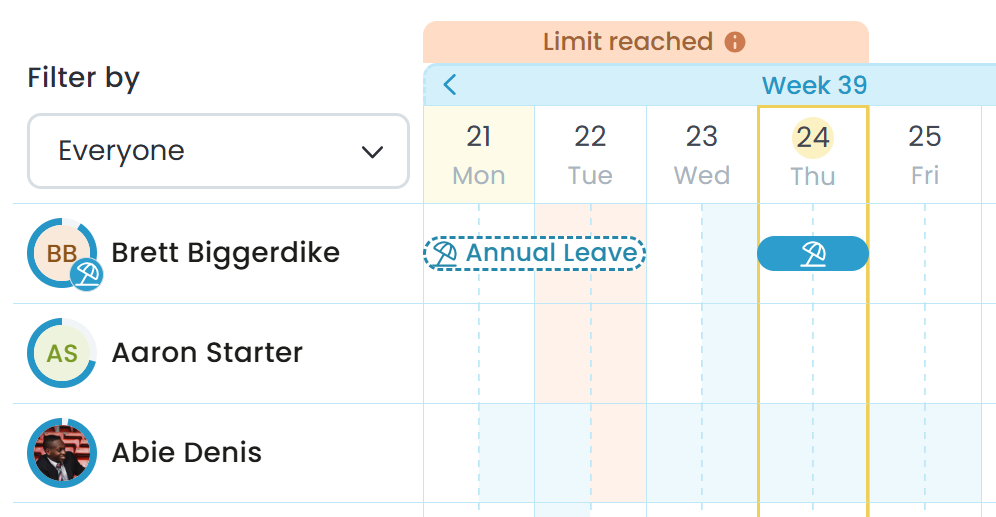
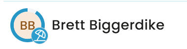
Anyone who is on leave today will have an icon showing on their avatar to make people aware.
Shorter requests (eg. an hour) are now represented by shorter bars to clearly highlight that it’s a fraction of a day.

Leave over a weekend or public holiday will not be shaded over the non-working period, making it easier to understand which days are impacting your annual leave deductions.

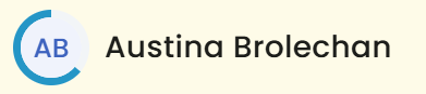
Remaining allowances are clearly shown as a circle around the employee’s avatar. Only those with the relevant permissions can see this.
Week numbers are shown above the column headings to help you keep track.

And that’s the latest list of new features. For more in-depth details about how to use your brand-new Wall Chart, click here.
Every change came from something a customer told us was missing or clunky.
So if there’s still something that would make your day-to-day easier, we’re listening.
